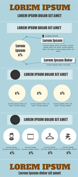
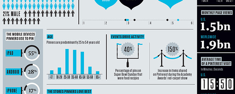
Ever wanted to create an infographic yourself? Why not…Infographics are still hot, entertaining and highly informative.
Piktochart is THE tool to help you with creating beautiful, explaining infographics (informative illustrations). I’m testing this cloud tool for you.
There are actually quite a few web tools that can turn your data into graphics. But we take a look at the newly updated Piktochart.
Step 1: Template
First you’ll have to click on Create an account and set a username and password. Then you’ll immediately enter a page where you have a choice out of seven free templates.
That isn’t a lot, but the themes are very diverse, so it could be useful for sporadic use. You could consider the Pro-version, if you plan to make infographics often. That will cost you $29/ month ( around €22) or $169/year (€130) and will give you access to a hundred templates.
You can start searching for themes in a specific category through the search box at the top of the page.
Step 2: Blocks 
When you’ve chosen a template, you can adapt the content of it. Such a template is built with several blocks. You can click on these, although it isn’t always clear which block you’ve selected.
With the black buttons at the top you can duplicate, delete or add blocks. Unfortunately, you can’t let them switch places with the mouse: you will have to use the Edit Layout-button to do so.
Step 3: Graphics
Every block is further composed out of different graphic elements. You can move and delete these, and in the lowest bar you can pick new elements to add. You will see Icons standard (you can let them show in diverse categories), but there are also Images among other things.
Here it also holds that the free version offers very limited options, while the paid Pro-subscription offer you more than a thousand items.
The fact that all the graphics are so called vector files is quite nice: those keep a sharp resolution when zooming in. For your information: you can also import your own images via Uploads.
Through the lowest bar you can add Text. There are standard web fonts plus almost 30 special letter types.
With Tools you can transfer data ,for example from a csv-file or manually entered data, into a graphic. But while changing data in an already imported table the module protested in my tests.
You can adapt the style, size, color of almost any element (icons, text, graphics, …) yourself, but try out Moods as well to change the color scheme at once. Besides, it is good to know that you can always undo your changes.
The result
You can save all the infographics you made online, but you can also generate url’s or embed-codes (to integrate in your website) or export them as jpg- or png-file. When you use the Pro-version, the Piktochart-watermark naturally will be omitted.


Matthew
on 21 Jul 2013Rebekka Deforce
on 22 Jul 2013Matthew
on 31 Jul 2013